coming up for air
Today feels hand-wringingly good. I’ve got fun news to share! I’ve had the same website for many years – after bouncing around with different styles, I settled on a simple, gorgeous design that highlighted the images with minimal text. Every time I updated it, it was through the lens of, “How can I make this feel more fine art? Higher end? More elevated?” I would take out anything that didn’t seem to fit that mold, tightening it up here, chopping something there. This went on for years and years (seven, to be exact!) until one day, I opened it up, and it hit me: this website is boring.
In my attempt to elevate, I erased. I erased my personality, I erased the warmth, and as much as it pains me to say, I erased the joy. I had a functional site, but it wasn’t fun (see what I did there?). There was basic information and pretty pictures, but it didn’t sound like me or feel like me. I ignored the problem for a good while (ask me for more tips on sweeping your problems under the rug!) until, last fall, I knew it was time for a major overhaul.
So I set to work. I spent this past winter in a near hermit-like existence, hours spent hunched over my desk, hammering away at the keyboard. I’ve got an entire notebook filled with scribbles and scratch-outs. I read books about crafting stories and took copywriting courses on finding your voice, reeeeally finding it – which turned out to be challenging because, in the wedding world, most people sound the same. (Two things you will not find ’round here – a single mention of how much “I love love” or any story about how I “picked up a camera and never looked back.”) I was ruthless. I slashed every word that didn’t feel right, any sentence that didn’t have a purpose or a point got the axe.
Yes, there are gorgeous pictures of real weddings but this time, I didn’t shy away from the copy. I stopped worrying about what the pages should say and poured all my energy into what I wanted to say. Words! I love ’em!
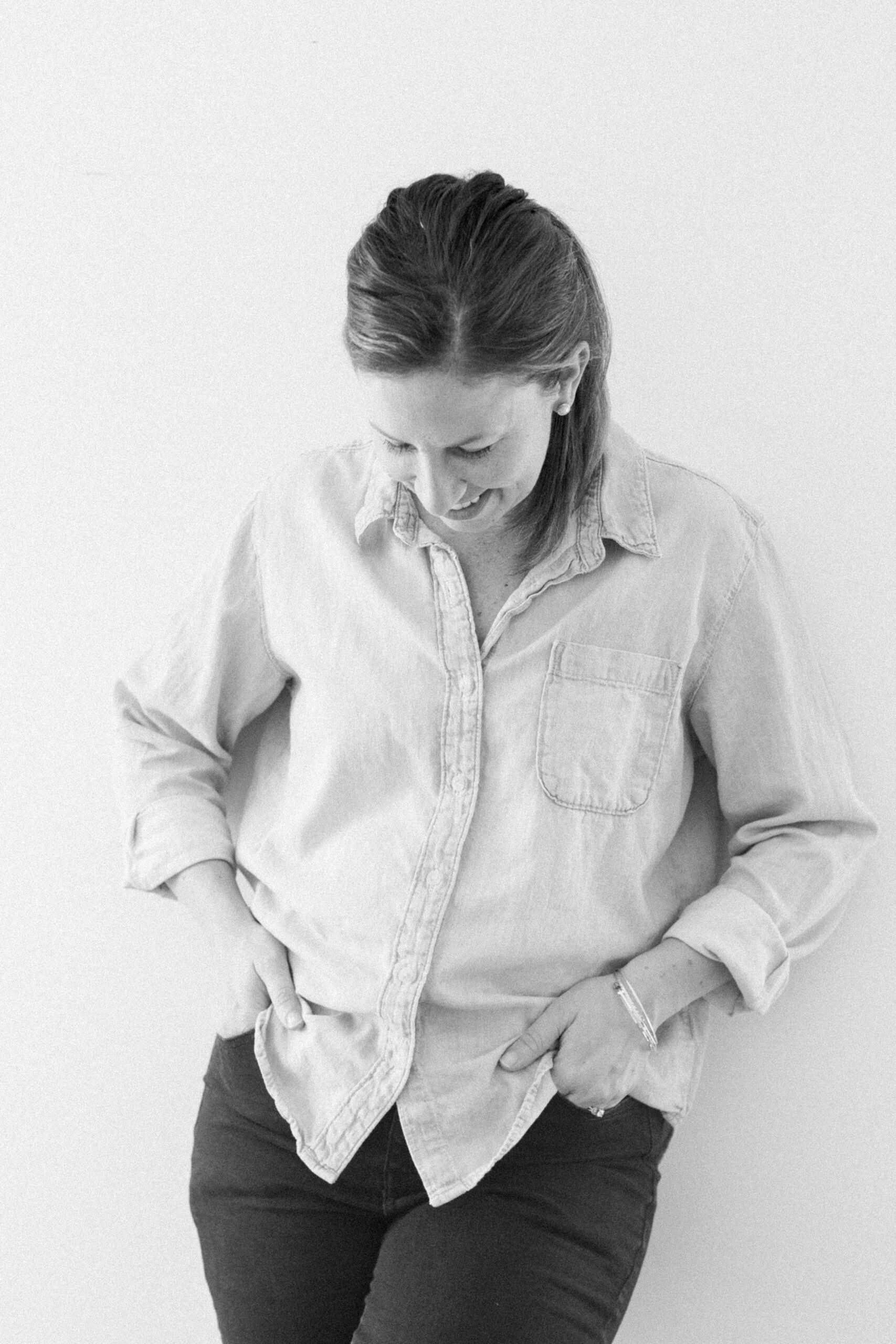
And after a whole lot of pluggin’ and and chuggin’ – it’s ready. It feels like a natural extension of my home and personality, and I hope you love it here. The pages feel alive, they feel like me, and I have a few noteworthy updates I hope you’ll check out:
There’s a dedicated page for Portraits and Galleries. I still think of myself as a wedding photographer, but I have so many sessions with families, newborns, maternity, and engagements that I’m proud to share.
The Experience and Information pages are some of my favorites. Oh, and Weddings, too. And the About page because there’s a GIF’d T-ball player you can’t afford to miss.
I wanted a full-screen home page, I love that immediate showcase of knockout images.
I wanted some color! My old site was mostly white, gray, and a really pale lavender. It used to feel high-end to me, but lately, it felt sterile. Lifeless. I went with a super rich, deep green as my primary and supplemented with champagne, mint, and a soft, muted pink. It feels downright luxurious.
So welcome! It feels so nice to get it out there and wrap up such a huge project before the wedding season starts again. Speaking of which – if you’re getting married in Maryland (or Pennsylvania, Virginia, or West Virginia!) and you need a photographer, I’d love to hear from you! Get in touch with me here.
